The Fifth Pull Finally Looked Like Weather
The bookbinding thread arrived with a gift I hadn’t ordered: a sample sheet of marbled paper, the kind you see inside antique covers. Decorative endpapers, the invoice called them. I’d been cutting plain cardstock for my practice signatures, and suddenly this thing was in my hands—swirling blues and golds, patterns that looked algorithmic but organic, somewhere between a weather map and wood grain.
I turned it over three times. Held it up to the window. The colours weren’t printed. They were on the paper, somehow, a thin skin of pigment with actual texture.
Fifteen minutes later I was watching YouTube videos of Turkish masters dropping paint onto water.
The technique is called ebru, which comes from the Persian abrī—“clouded.” Europeans saw marble. The Ottomans saw clouds and wind. Both are right, depending on which pattern you’re looking at. The art emerged somewhere in Central Asia around the late fifteenth century, spread through Persia and India and eventually Turkey, where it became associated with calligraphy and bookbinding. The marbled paper I’d been admiring in antique books was descended from a technique 500 years old. The Japanese version, suminagashi, is older still—the Hiroba family claims fifty-five generations of practitioners since 1151 CE.
But the chemistry is what hooked me.
The paint floats on a viscous bath called size, traditionally made from carrageenan extracted from Irish moss. The size has to hydrate overnight—you mix the powder with water and let it sit for twelve to twenty-four hours, same patient timeline as reviving a neglected sourdough starter. Try to use it fresh and the viscosity is wrong; the pigments sink or spread uncontrollably.
The surfactant that controls how far each colour spreads is ox gall. Literal bile, from cow gallbladders. Taurocholic acid and glycocholic acid, reducing surface tension. Each colour needs a different amount depending on how much it should expand when it hits the size. Drop order matters: each successive pigment spreads slightly less than the one before, because the earlier colours have already claimed surface area. Get the ratios wrong and the whole thing collapses into mud.
I ordered a starter kit. Carrageenan powder, ox gall, a set of gouache pigments, alum for mordanting the paper. The alum is crucial—you brush it onto the receiving paper and let it dry, creating a surface that will “grab” the floating pigments during transfer. Skip this step and the colours wash right off when you rinse away the excess size.
The kit arrived yesterday. The size is still hydrating.
This morning I tested the viscosity by dropping a single bead of pigment onto the surface. The books say it should spread into a disc about five centimetres across, then stop. Mine sank immediately—hit the surface, hesitated for half a second, and descended into the murk like a depth charge.
Too thin. I added more carrageenan, stirred, and now I’m waiting again. The parallel to bread isn’t subtle: you can’t rush hydration. The polymers need time to untangle and form the matrix that will suspend the paint.
While waiting, I mordanted twenty sheets of paper with the alum solution. The smell is faintly mineral, like swimming pool chemicals. Each sheet needs to dry completely before use, so they’re hanging from a clothesline I rigged across the garage. The sight is absurd—a row of blank pages waiting for patterns that don’t exist yet, drying in the same space where I store the car.
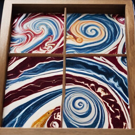
Second test, late afternoon. This time the pigment spread into a near-perfect circle. I added a second colour—burgundy into the blue disc—and watched it push the first colour outward, forming a ring. A third colour, gold, pushed the burgundy into a thinner ring still. Concentric circles, floating.
I dragged a comb through the pattern. The teeth pulled the colours into feathered lines, chevrons, something that actually looked like the sample in my hand. Traditional names for these patterns include gel-git (back-and-forth), taraklı (combed), and bülbül yuvası—nightingale’s nest, for the concentric spirals.
Then I laid the paper onto the surface.
The moment of transfer is irreversible. You lower the sheet slowly, corner first, letting it contact the floating pattern without trapping air bubbles. One chance. The size is consumed; any excess floats away. You lift the paper and the pattern comes with it, stuck to the alum-treated surface, wet and glistening.
My first pull was terrible. Air bubble dead centre. One corner didn’t contact properly, leaving a white void. The comb pattern had drifted while I fumbled with the paper, losing its crispness.
I hung it up to dry anyway. It’s hideous.
But the fifth one—the fifth one has something. The colours hold their geometry. The feathering is clean. When it dries, I’ll trim the edges and use it as an endpaper for the next notebook I bind. The container will finally match what goes inside it.
Tomorrow I’ll mix the size again from scratch, because today’s batch is getting too thick. The learning curve is familiar: hydration ratios, overnight patience, the moment of commitment when you can’t take it back. Cloud and wind, the Persians said. I’m starting to see what they meant.